Friday, May 2. 2008
Ever wanted to take clean snapshots of your screen? Especially on Vista? Including the translucent window title bar and the shadows? Don't want to bother with your desktop background?
Window Clippings by Kenny Kerr is a very powerful solution which allows you to create simple snapshots, but also complex ones, e.g. with open submenus. Install the tiny piece of software and press Print Scrn.
It is not free, though. Alas. But it is worth its $18, down to the last cent.
Wednesday, April 30. 2008
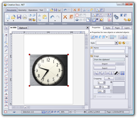
I have just uploaded version 2.2.0 which is now available publicly. This version fixes a few minor problems and comes with improved paste support: - When pasting an image from the clipboard, Creative Docs .NET automatically creates a new image object, possibly scaled down to fit into the active page.
- When pasting text without being in a text object, a new text object is created, or the best text object is automatically selected and the text is inserted.

Let me know if you have any issues with this release; as always, use the e-mail address bugs at this website.
Tuesday, February 5. 2008
Epsitec SA, one of the two companies who is making the development of Creative Docs .NET possible, will be celebrating its 30 years in a few days.
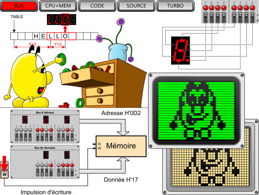
In order to commemorate the heroic days, Daniel Roux, co-author of Creative Docs .NET, wrote a free software simulator of a tiny computer, the Dauphin, developed and distributed by Epsitec SA in 1978. The pages are in French or German, but those tempted to play with a primitive microprocessor might attempt to program the simulated Dauphin without reading the accompanying user's manual.

An assembly language programming contest is open until end of April 2008. The 5 best submissions will be awarded prices kindly offered by Logitech Switzerland. Good luck!
Monday, February 4. 2008
I have just uploaded version 2.1.8 which is now available publicly. This version fixes several minor problems, amongst which: - The PDF export sometimes produced images turned upside down
- Embedded fonts could not always be reopened if the font was missing on the target computer
Once more, thank you to all of you who reported bugs.
Wednesday, November 28. 2007
We released version 2.1.3 a few days ago. This is, again, mostly a bug fix release. Thank you to all the great people who report bugs and therefore contribute to build a better product.
Sunday, September 30. 2007
Download version 2.1.2 here. This is mostly a bug fix release, unless you are using it to generate PDF, in which case you should definitely switch to this 2.1.2 version.
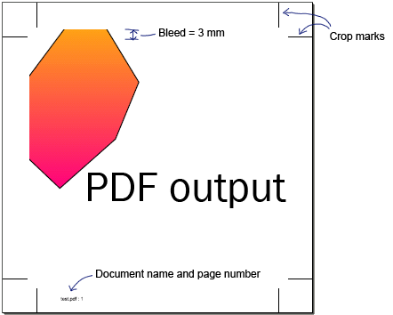
Indeed, those of you who use the PDF export feature, will be glad to see improvements in the bleed and crop mark handling. For instance, imagine you work on a document measuring 100mmx100mm, with a 20mm area outside of the page. When you export to PDF, you specify a bleed of, say, 3mm.

The crop marks will be automatically placed just 1mm outside of the bleed box. And as you can see above, the document has some objects which protrude outside of the page. The part which exceeds the bleed box will be clipped. Here is the resulting PDF, as rendered by Acrobat:

The PDF file now also includes meta information, such as the title and the creation date.
Monday, July 23. 2007
We have fixed a few minor bugs. The most visible problem was related to how embedded document fonts were handled (I'll spare you the gory technical details). You can download Version 2.1.1.
I've also decided to follow Rick Brewster's tip ( Have a Donate Button) by providing a link to the donate page when the update notification dialog appears. Let's see if this proves more effective than just the naked "Make a donation" button found on the main page navigation menu; but to know, I'll have to wait until I release a 2.1.2 version, as the new dialog won't show up for you now.
If you want to test the donate feature, you are welcome 
Monday, July 9. 2007
Maxim Shemanarev, author of the AGG graphic library has just released an interesting article about font rasterization.
As a teaser, I'll just show you an image of what Maxim achieves with his graphic library and the FreeType auto-hinter, which is amazingly readable when compared with Apple's Safari way of rendering fonts (see my previous post), and has an excellent typographic layout:

I'd love to produce this kind of rendering with Creative Docs .NET. This will, however, require some work on my side: I'll have to use FreeType rather than my own OpenType glyph contour extraction code and I'll have to seriously check the performance of the new code. Rendering with ClearType like sub-pixel RGB output requires per-channel alpha blending. How does it impact performance? I've no idea.
Wednesday, June 13. 2007
Steve Jobs announced the release of Safari for Windows XP and Vista at this year's WWDC. This brings a few new pieces of Apple technology to the PC, in particular the font rendering which is used in Mac OS X. This produced quite a few interesting reactions (read Jeff Atwood's Coding Horror and Joel on Software), since Apple is using high quality sub-pixel glyph positioning.
High quality sub-pixel positioning is not compatible with crisp and pixel aligned character stems, which is the base for Microsoft's ClearType technology. Yes, I agree, Apple fonts look more blurry when compared to those rendered by Microsoft, but it cannot be avoided if you want to respect the font shape at any (possibly fractional) font size.

In Creative Docs .NET, I chose the same route as Apple: make sure that characters get positioned in the most precise way. However, my rendering algorithm simply relies on path filling as implemented by agg. I don't have access to the more subtle RGB smoothing used by both ClearType and Apple's font engine.
Monday, June 4. 2007
I finally found the time to build a public release of Version 2.1.0. There are plenty of small improvements: - The full user interface is now available in German (thanks to Thomas Efer who translated the tons of texts found in Creative Docs .NET). If your Windows Regional and Language Settings are set to German, you will automatically benefit from the translation.
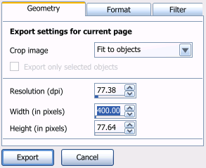
- The image export filter is now much richer: you can specify if you want to export the full page, the area covered by the graphic objects (fit to objects) or only the area covered by the active selection (fit to selection). You no longer have to rely on an external bitmap editing tool to crop the image.
- The polygon object has now additional properties which can be used to produce various effects:
Aditionally, there were a few bug fixes. Please continue to report them to bugs at creativedocs.net.
Tuesday, May 8. 2007
I have just come across this KB article from Microsoft which lists all applications which have earned the "Certified for Windows Vista" logo. I've been very surprised to see that there are currently (May 2007) just 237 such applications. If you remove those belonging to Microsoft, the number falls to 207.
I find these numbers really amazing. What does this mean? I wonder... Are the software companies not interested by the Vista logo? Is it that hard to implement the changes required to pass the certification? It cannot be the price, as Microsoft was/is still sponsoring the certification process...
For me, going through the certification process was an interesting experience. And it forced me to better understand areas such as MSI, discover new tools (such as the Orca database editor), getting access to WinQual and, best of all, play with new technologies such as the Restart Manager.
Sunday, April 22. 2007
Creative Docs .NET has its own OpenType engine. Most of it is implemented in C#, from the OpenType table analysis to the metrics extraction, glyph mapping and substitution code. For the rendering, it feeds 2D curves to the agg back-end.
In order to present the fonts in a meaningful manner to the user, I decided to group them into families, which seems logical.
The family is basically defined by the Font Family Name (ID 1) in the "name" table of the OpenType font (this would be "Arial" for "Arial", "Arial Bold", "Arial Italic" and "Arial Bold Italic", but "Arial Black" for the Arial Black font). But there is also another entry in the "name" table, called Preferred Family (ID 16), which is not mandatory and did not exist in the fonts installed with Windows XP.
Some Adobe fonts, such as Warnock Pro, which exists in 32 different variants ranging from "Light Italic Caption" to "Semibold Subhead", use this Preferred Family name ("Warnock Pro") with the Preferred Subfamily name ("Light Italic Caption"). My version of Microsoft Word does not recognize these fonts as belonging to a unique family and shows a long list with "Warnock Pro", "Warnock Pro Caption", "Warnock Pro Display", "Warnock Pro Light", etc. and it happily mixes font weights ("Light", "Semibold", etc. with the optical suffixes "Caption", "Display", etc.).
Warnock® Pro Light Italic

I chose to take into account the Preferred Family name if it was available, and if not, fall back and use the Font Family Name. That's why Creative Docs .NET presents Warnock Pro as a single family with 32 styles, yet shows "Arial", "Arial Black" and "Arial Narrow" as three different families under Windows XP.
And here comes Windows Vista... There have been a few updates to the fonts, especially "Arial Black" and the "Arial Narrow" families. Do you guess what changed? Microsoft decided to define a Preferred Family for these fonts. Great.
The trouble is, when Creative Docs .NET (up to 2.0.14) saves formatted text in its *.crdoc documents, it stores the font family name and the font style name to uniquely identify the font. But for Arial Black, this is "Arial Black" and "" under XP. Under Vista, this font cannot be found, as its identity has now changed to "Arial" and "Black".
I've fixed this issue and a new version of Creative Docs .NET will be released in a few days.
Friday, March 30. 2007
I forgot to blog about version 2.0.13, available since end of February, and you did not miss anything really important, as it was mainly a bug fix release with a different implementation for the open file and save file dialogs.
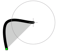
Version 2.0.14 is the first version of the year which offers really new and interesting features: - A new Freehand Drawing Tool which can be used to draw smooth curves without having to be a Bézier guru:
When you start drawing, a circle appears which shows the distance you have to move to generate the next point on the curve. You can adjust the radius of this circle with the mouse wheel or the arrow keys.
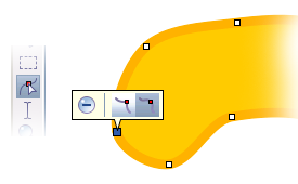
When you are done, you can modify your curve with the Shaper Tool
- We updated the PDF export filter in order to make Adobe Reader 8 happy with our text output. Somehow, Adobe Reader 8 expects to have a bounding box information for every character definition, which was optional before. Trying to providing a dummy value instead leads to a crash! But with Creative Docs .NET 2.0.14, this is no longer an issue.
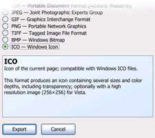
- A new ICO export filter, which relies on the IconLib library, found on the CodeProject (thanks Gustavo!).
Creative Docs .NET generates either a standard icon file with the expected 48x48, 32x32 and 16x16 sizes and 32-bit ARGB, 256 color and 16 color modes, or a Vista icon file which includes a high resolution version at 256x256 pixels.
For the German users, there is a little surprise: about half of the texts and messages have already been translated in German (thanks, Thomas!).
Friday, March 23. 2007
Yes, that's right, I won't turn my computer on on March 24. I found the idea of a Shutdown Day interesting enough, and since it is on a Saturday, I can afford not to use my computer. A week day would have been rather problematic.

Thursday, March 22. 2007
I've been very surprised to find Creative Docs .NET listed in the "Top 5 Graphics & Design" on Windows Marketplace :

Thank you to all of you who are using Creative Docs .NET and are giving us positive feed-back. Keep the comments coming!
|
